


As we continue our exploration into the beautiful numbers and letters that will be donned across football shirts ahead of the season, we take a look at the latest offering from Napoli.
Not too dissimilar to that of Chelsea, a common theme is already starting to occur. The use of inline fonts is clearly well suited to on the pitch attire. The 15/16 type that Napoli are using is a subtle and tasteful font adding a touch of charm to the already suave kits, created by Kappa.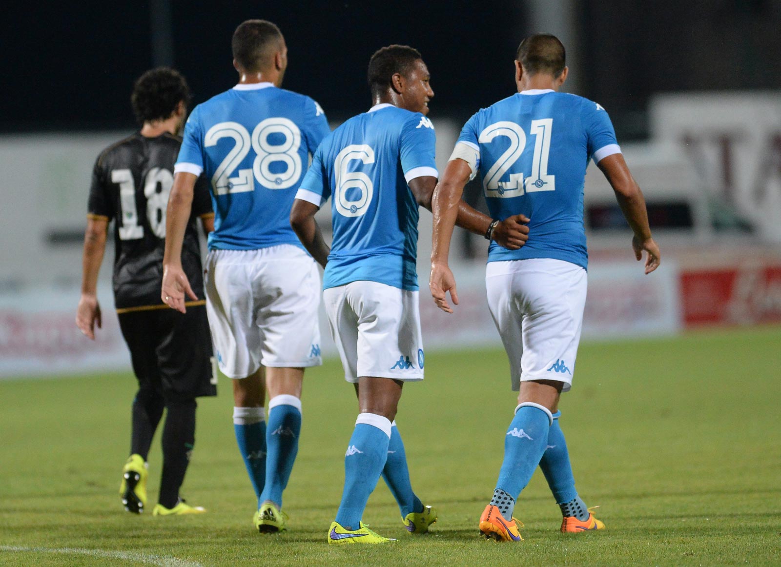
These fonts, will be used for all competitions. Unlike Chelsea and teams of the Premier League, the Serie A does not have one uniform font for kits so clubs have free creative reign to do as they please. All for that.
Typography is perhaps the hidden art of football. This series will celebrate the creativity that takes to the pitch in heroic fashion.


