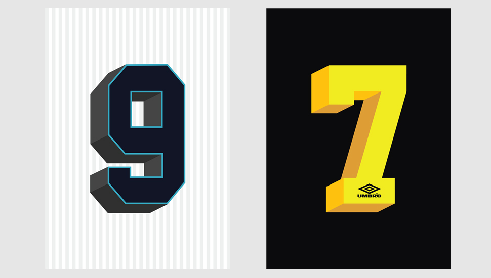
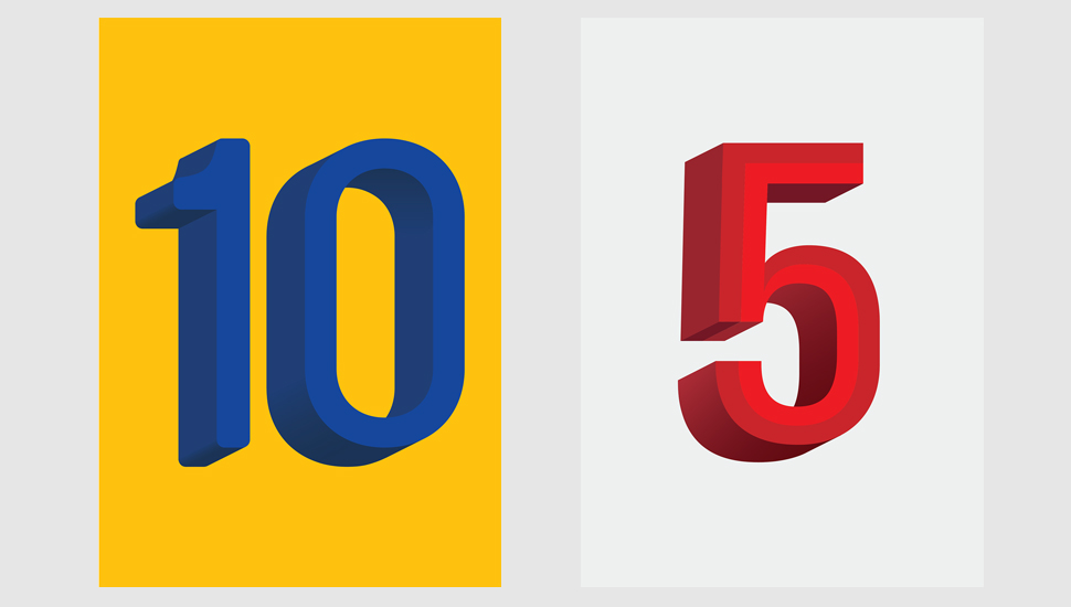
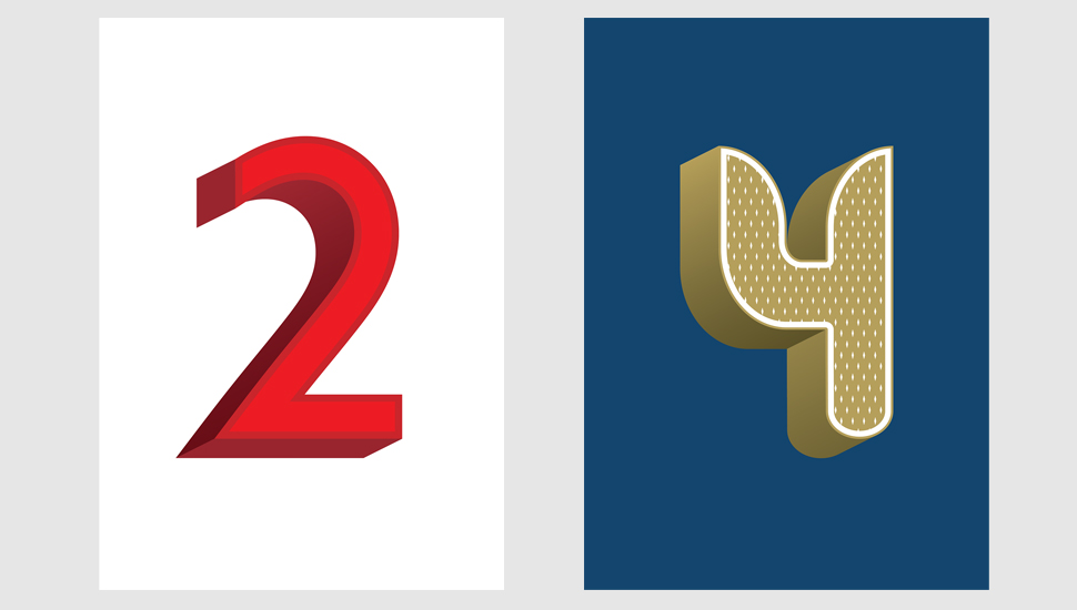
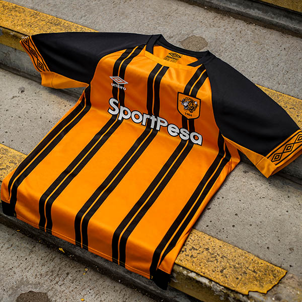
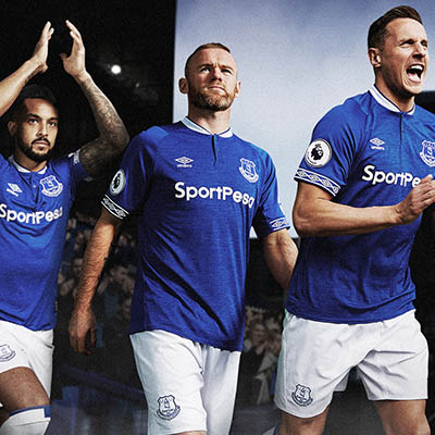
Ever the appreciators of the work that goes into the finer detail of football kits, typography plays an iconic part in creating that perfect football kit.
With a legacy of pioneering football and design, Umbro is a brand that has built its heritage on providing a tailored finish on the game. Elliott Smith is one of the designers at the brand who worked on an in-house project, showcasing shirt numbering that has been produced by Umbro and we caught up with him to find out a little more about these beautiful prints.
"The brief was to look at Umbro's relationship with football typography over the years, particularly shirt numbering as it was something that everyone could easily recognise. I looked at shirt numbering on Umbro kits from the early 90's to recent years as they had a much wider variety of styles, especially when it came to European tournaments which allowed a more open use of fonts. Rather than keeping them flat, i wanted to produce a set that had some 3D depth but complimented the number, so I kept to a palette of three colours or subtle gradients when illustrating the depth.
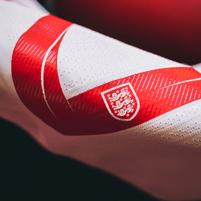
A few seasons back we were using fonts like Brauer Neue by the Lineto Foundry which found its way onto the Sweden kits, it looked stunning when it was on the field. The England kits saw fonts that were bespoke for the uniform too, a particular favourite was the Euro 12 font by Paul Barnes. They felt like a complimentary finish to the Umbro kits that they appeared on."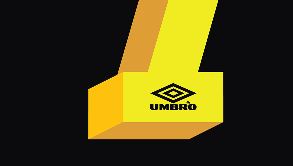
The typography on football shirts is often something that occupies part of the subconscious of the appreciator of the game. This project is testament to that; instantly recognisable whether worn by Cantona or Shearer - one of the reasons football shirts become so iconic is hidden in the finer detail.
