Japan have caught the attention of the world with not just their performances in Qatar, but also their striking kit design from adidas. But this is merely the latest in a long line of superb Japan kits over the years, and here we take on the unenviable task of picking out the 10 best.
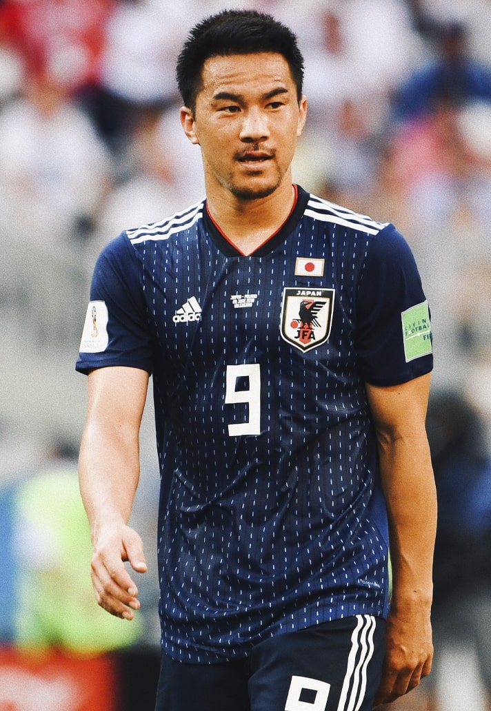
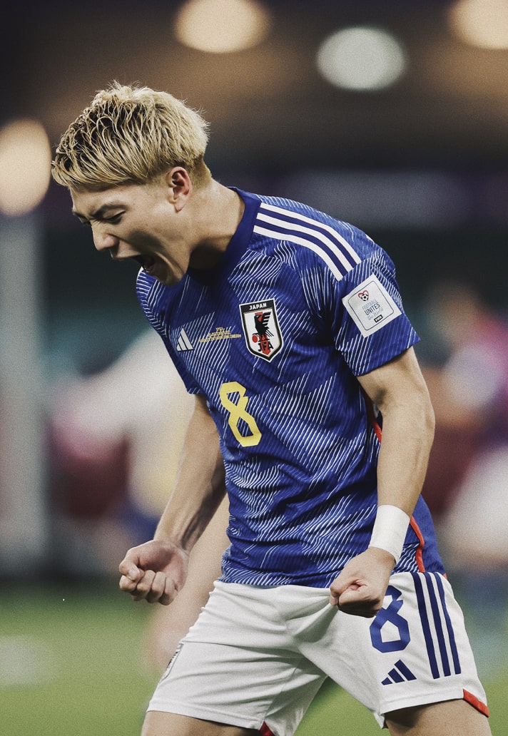
With their gritty performances and never-say-die attitude, Japan have captured the hearts of many fans watching the World Cup this year, besting Germany and Spain in the group stages to top their group and set up a knockout round of 16 clash with Croatia on Monday, 5 December. But they’ve also caught attention for another reason: their kit. While we’ve yet to see their away strip in action, it’s every bit a match for the quite sublime home design; adidas once again gracing the nation with one of the strongest looks on display in Qatar.
It’s not like it’s unusual for Japan to look so good on the pitch though. A prolonged period with the Three Stripes that started in 1999 has helped the nation find its groove and consistently rank amongst the best dressed in the world. However, their sterling style didn’t start with adidas, and it was actually Japanese brand asics who had an absolute blast with the them in the 90s, kickstarting a new ‘Samurai Blue’ identity after a topsy-turvy period that saw them in red for a little while at the end of the 80s, and at one point in the mid 90s wearing the same kit with adidas, PUMA or asics branding on it on different occasions. Strange times, but all part of what is a rich history.
Now, we pick out what we think are Japan’s 10 best home shirt designs of all time. With so much goodness to choose from, this was no easy task…
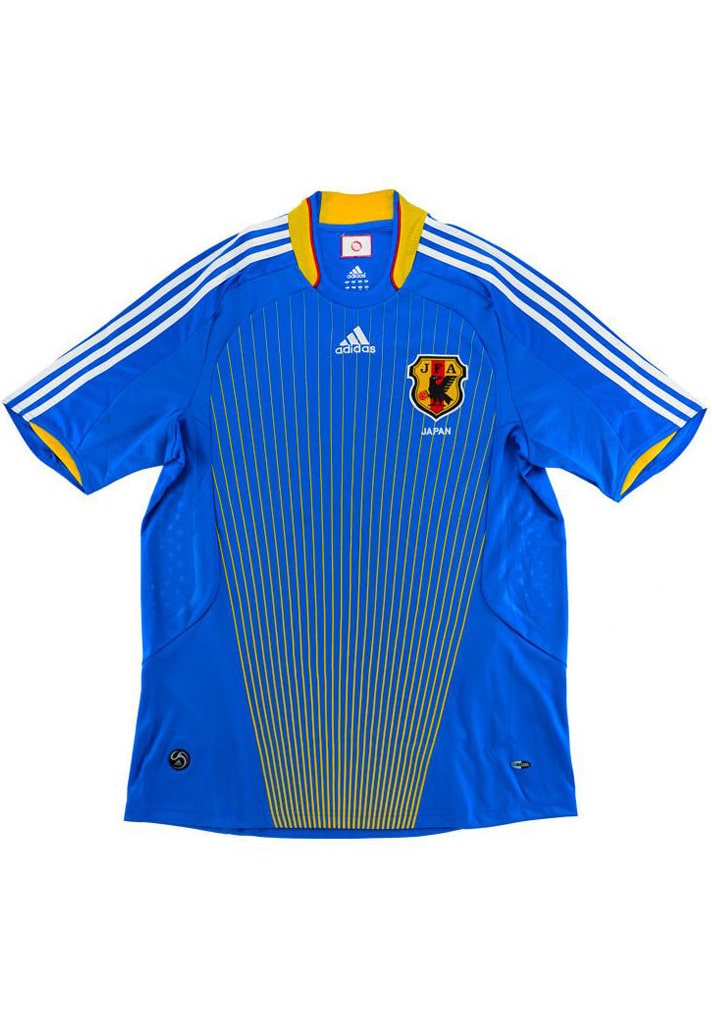

10. 2008
Starting off with one that stands out for its bright and unorthodox use of yellow, presented as pinstripes on a lighter tone of blue than usual. Yellow accents on the collar and cuffs finish this look off. Experimental, but works for us.
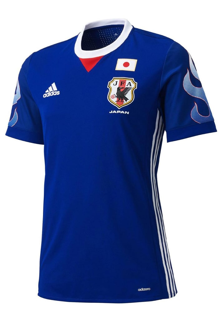
9. 2017
Were this not a homage-fuelled design, it would've most definitely ranked higher. The flames on the sleeves are lifted straight off the designs from the 90s (more on them to come), while the positioning of the Three Stripes on the sides and the red detail just off the collar complete a tidy look.

8. 1999
Most notably worn in the Women's World Cup of that year, the 1999 home shirt was the first of adidas's latest stint – one that continues today. The collar and the block colours properly mark out the generation that this one starred in.
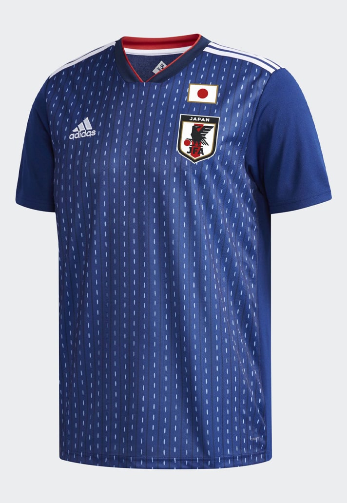
7. 2018
Home shirt design can often be bogged down by tradition, but the 2018 home shirt is the perfect example of how a bit of free rein and creativity can really lead to iconic looks. Here, darker navy tones played host to a dotted pinstripe effect for unique style.
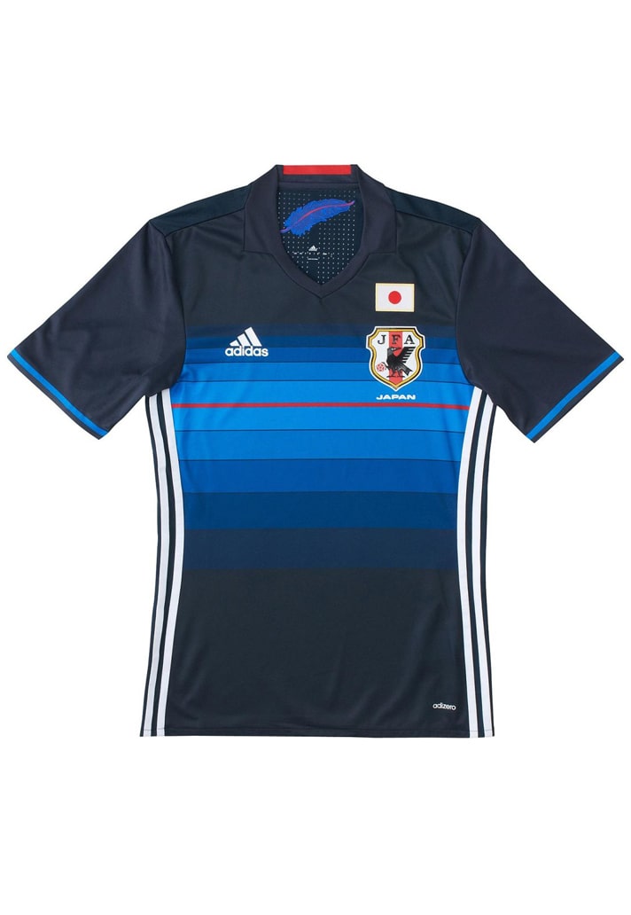
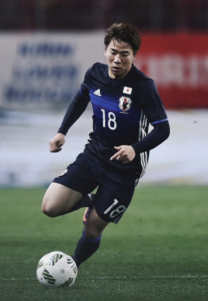
6. 2016
Another that veered away from the traditional setup to venture into new territory, the 2016 home shirt opted for a darker base, interrupted by a horizontal fading band of brighter blue that emanated from a central red line. A stark contrast to others on this list, but the variety being one of the reasons why Japan boast such a strong back catalogue.
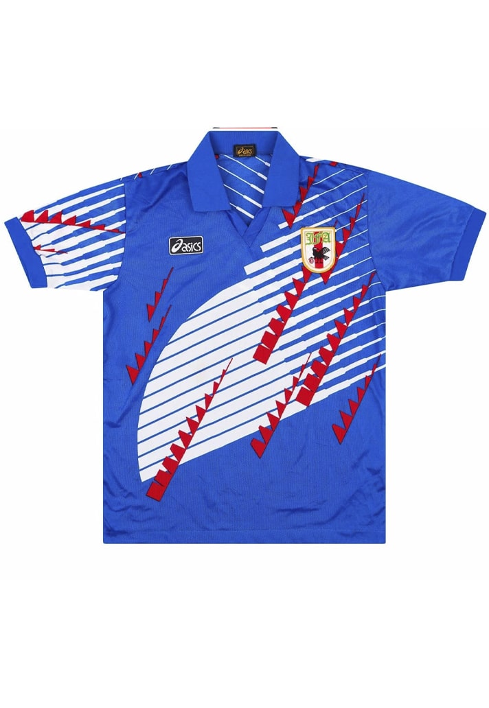
5. 1992 & 1994
Remember we mentioned that topsy-turvy period in the nation's kit history? Well this one is the epitome of that. A proper 90s throwback, it was produced 'in-house', and so at one point or another featured adidas, asics and PUMA's branding, while it was used in 1992, then again in 1994 and 1995 – not something we're complaining about. Bring it back for a fourth stint we say!
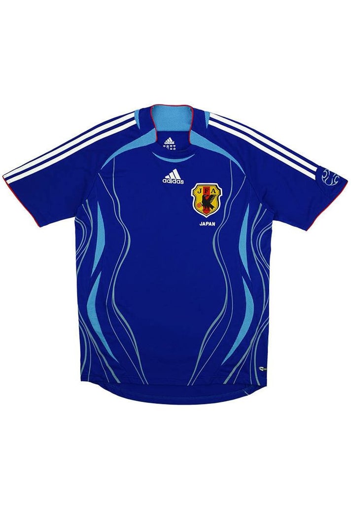
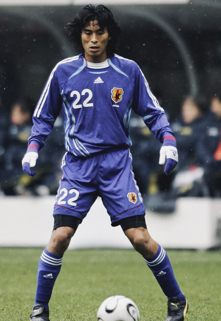
4. 2006
One look at this should instantly tell you that it was from 2006 – the era of Teamgeist. And adidas really did Japan a solid with their design, those side graphics and combination of blue tones fitting perfectly into the overall aesthetics.
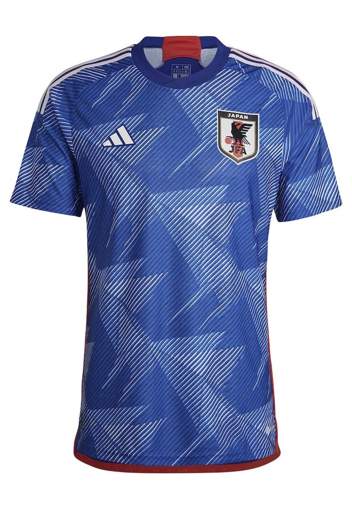
3. 2022
Depending on how much further Japan can progress in Qatar, this one could well climb a little higher. As it is though, it well and truly earns its position in the top 3, by virtue of an origami-inspired sublimated pattern on that lovely tone of blue. And to whomever made the decision to include yellow font for numbers and names, throwing back to the colour's inclusion in 2008? Hats off...
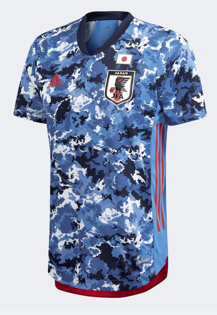
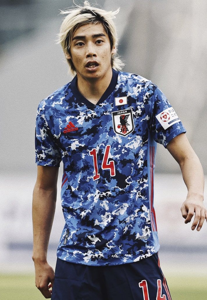
2. 2020
Featuring a statement multi-hued, camouflage-like pattern, the 2020 home shirt was worn by Japan at the Tokyo Olympics and it instantly stood out as one of the best on display. Very BAPE meets F.C. Real Bristol, and we can't get enough of it.
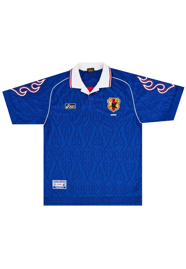
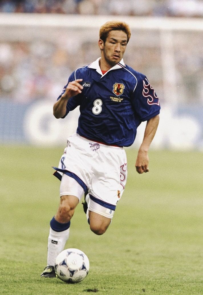
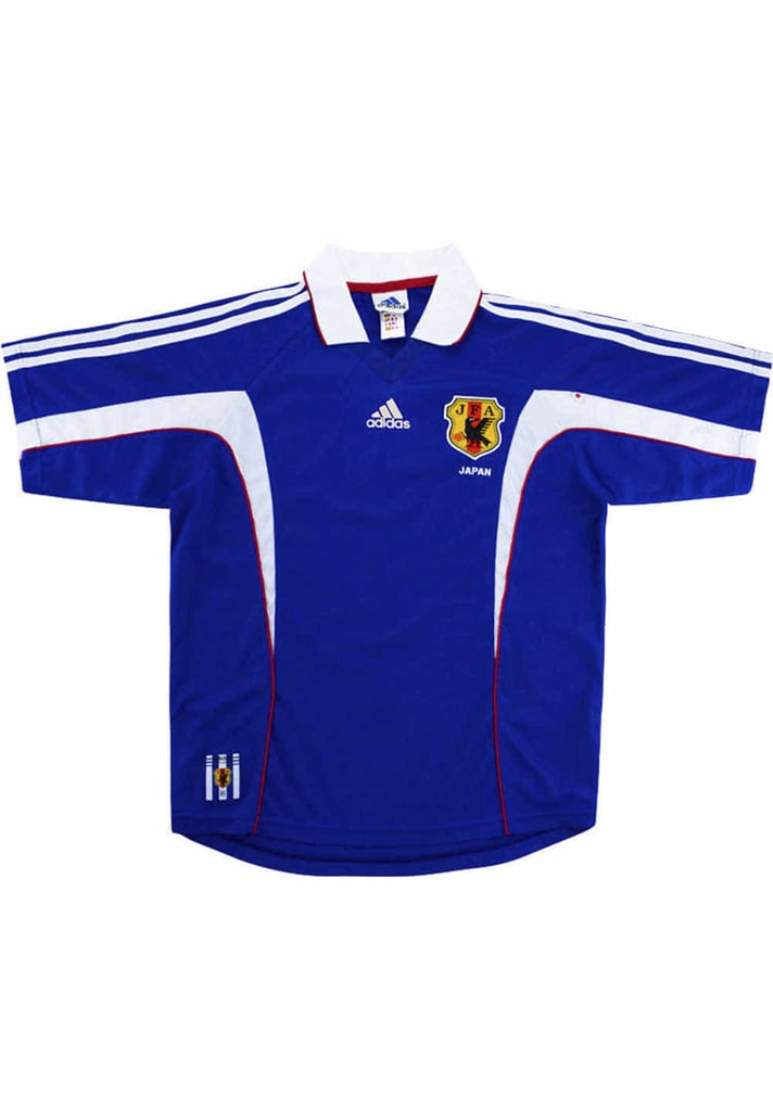
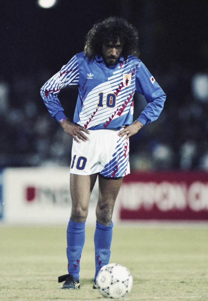
1. 1998
Is there such a thing as shirt perfection? Well, if there is, then this isn't far off it. The collar, the baggy fit, the flames... it just has it all and is the perfect example of 90s shirt design. Could have just as easily been the 1996 home shirt, with not much of a switch up between the two (slightly different flame execution on the sleeves and some piping on the '98 version) but we plumped for the later design.
Shop Japan replica at prodirectsport.com/soccer