
For the first time in 10 years and falling in line with a refreshed Premier League brand, official partner 'Sporting iD' have worked with the league to create a bespoke typeface that will land on clubs from the 17/18 season.
The overhaul of the Premier League, embraced with the help of DesignStudio ahead of the 16/17, season offered a vocally visual approach to a brand that sits at the forefront of popular culture. For the 2017/18 season, long term supplier of letters and numbers Sporting iD, were enlisted to develop the official type. Clean edges and adding a sharper finish with a streamlined shape, for the first time there will be five approved colourways to sit across the various colours that Premier League shirts drop in with.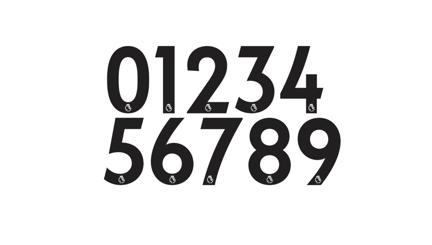
While the Premier League has commanded a crown in football's jewel for the previous twenty five seasons, there have been just a small handful of changes to the on-pitch typography that we have collectively and subliminally taken in for so many years. Going back through the timeline, below reins supreme in a time when CR7 was residing at Old Trafford.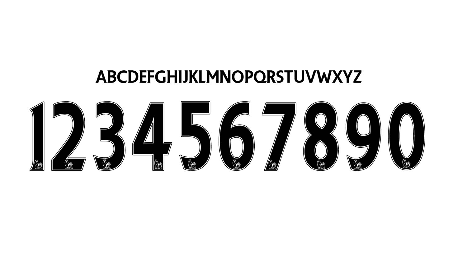
Further back in the memory however, from Ole Gunnar Solskjaer to Matt Le Tissier, the showing below personifies an era that defied convention. When mavericks went by the name of Barry Hayles and Steve Ogrizovic.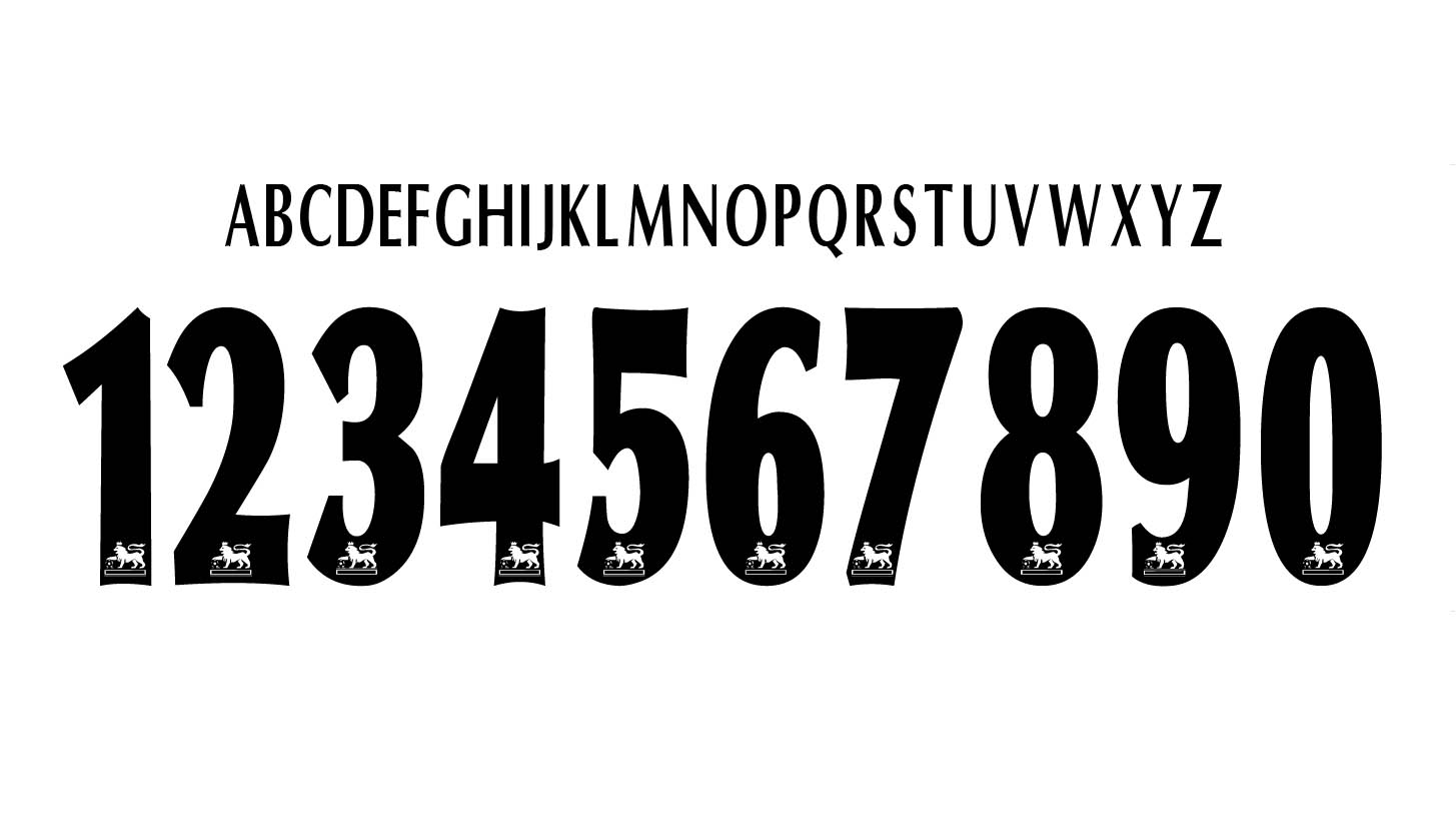
Look closely when the international break is over, right now the current type still holds last years branding. All change from next year when the reworked line takes his place.


