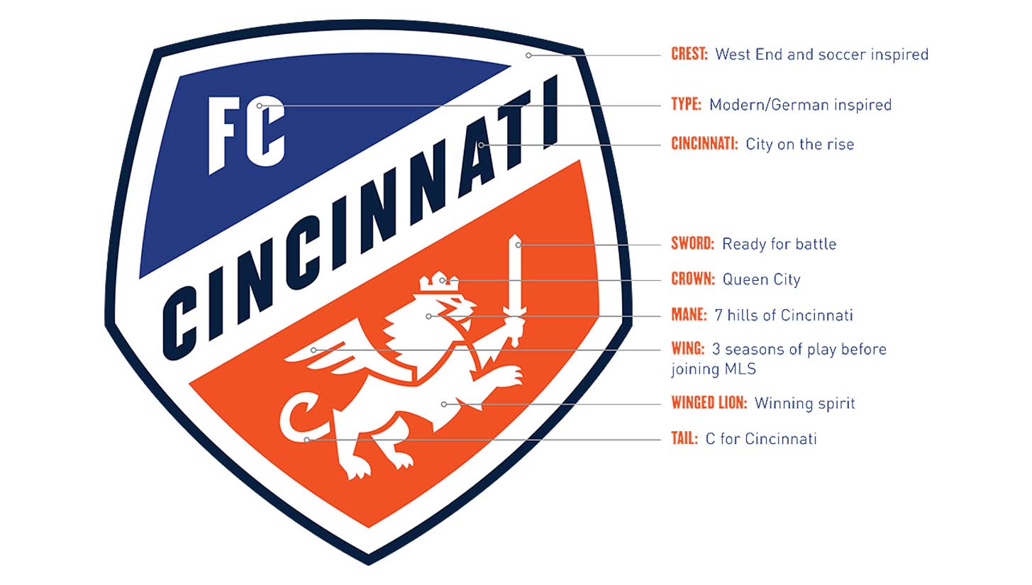
Having been announced as the latest MLS expansion team, FC Cincinnati recently unveiled their updated crest ahead of their inaugural season.
With FC Cincinnati's long-awaited and much-speculated MLS identity confirmed, the club took the opportunity to reinvent their crest, which they’d been using in their three-year long stay in the USL. Interbrand spearheaded the redesign, having been involved with the new crest for Juventus as well as the branding for the 2014 and 2018 Winter Olympics.

The new crest is steeped in symbolism, with the design meant to celebrate the city’s German heritage in a modern way. The lion’s crown pays homage to the “Queen City,” while the seven points of its mane are a nod to the seven hills of Cincinnati. The three-feathered wing represents the club’s three-year journey to MLS and, finally, its tail takes a distinct “c” shape.
It’s a nice rebranding that retains the essence of the original logo, while updating for the new, greater challenge that lies ahead. The club have also made a subtle change to their club colours, retaining the same orange and blue only now slightly brighter and bolder.
FC Cincinnati will be the 24th club in MLS next season, with the league continuing in its attempts to expand to 28 teams.


